Following
our research into the Pantone Fashion Colour Report for 2012 (see our post about it here), the Little Birdie
girls have become more and more infatuated with colour palettes.
We were
excited to read about spring colour trends, as designated by the colour
experts, Pantone, released in their Fashion Colour Report for 2013. The report
was released for New York Fashion Week (September 6 – 13). As the fashion world
is 6 months ahead, and Australia has the opposite season pattern to America, we
will probably start to see these fun shades feature in upcoming summer
fashions.

Here
are some intriguing colour combinations:

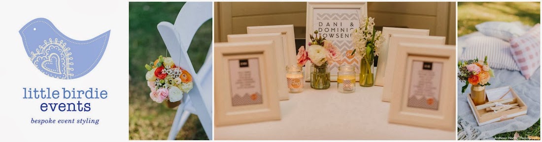
The "unexpected" combination of Dusk Blue and Nectarine reminds us of the Giggle & Hoot-inspired dessert table we styled for one-year-old twin girls, Abi & Emi - check it out here.
The executive
director of Pantone Colour Institute, Leatrice Eiseman, has described the
Spring 2013 colour palette as emphasizing the “need for balance, while at the
same time allowing for individuality, self expression, and excitement.”
The Little Birdie girls are
certainly finding these out-there dynamic tones combined with soft, calming hues very
exciting! Like the palette for Spring 2012, you will definitely be catching
these colours in our upcoming work.
Carole & Gerri
No comments:
Post a Comment